I started my design career long ago, back when we our design layouts were called paste-ups, because we would actually paste blocks of type and photos down on art boards. There was a device called a waxer which had hot, melted wax in a reservoir and you would run your carefully cut-out section of paper with typeset copy through the cylinder rollers and get the back of the paper waxed. Then while the wax was still warm, you would press it to the paste-up board and line it up with the blue pencil page grid using a t-square. The wax would give a little ’til it cooled, giving you time to push the text block around. That’s just one example of how being a designer was part craft and part design, you had to create precision by hand, using hand tools, pens, brushes, erasers and white gauche.
Then the Macintosh computer was introduced into the design industry. By the late 80’s, the Mac was becoming a standard tool for the designer (although it was expensive, $2K to $4K, of 1980’s money for a decent Mac system). Suddenly designers could set their own type, line things up instantly with virtual gridlines (that could be moved!). Photos could be easily dropped in and resized, perfect rectangles and circles could be created instantly.
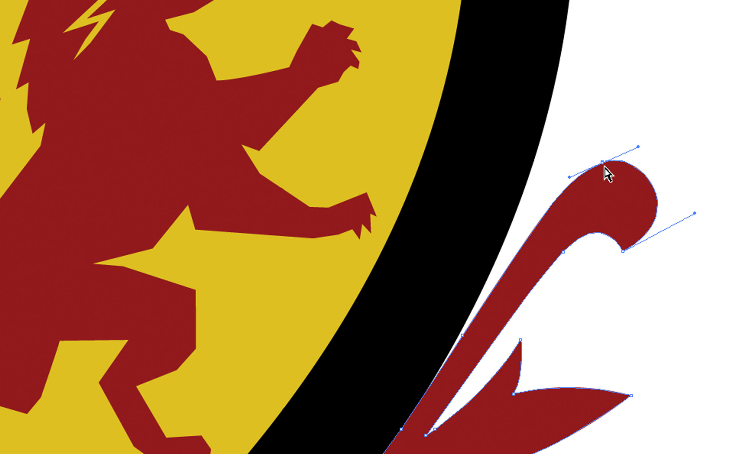
The first program I used on a Mac was Adobe Illustrator, which allowed creation of these perfect shapes and curves by using vectors, or mathematically based paths, built with anchor points and bezier curves, which are manipulated by handles. These shapes are resolution independent, and so can be scaled to any size without loss of clarity. Therefore, complex designs built with vectors can scale up or down easily, always maintaining crisp edges, unlike designs created with Photoshop. Photoshop images and photos in general, are pixel based, so they can only be scaled down to maintain clarity. Scaling a pixel based design up can be done, but it reveals the lack of detail and becomes fuzzier the larger it is scaled. A pixel based image has a huge advantage however, they are needed for photos and other complex images with gradients and soft lines. Vectors are really meant for images that have crisp edges with flat colors.
For almost all the years of web design, from the early 90’s to fairly recently, pixel based images were all we had to work with to build web designs. Web browsers didn’t support vector files consistently until the past few years. The vector format of the web is called an SVG (Scalable Vector Graphic) and finally has universal support among all modern browsers. This has opened up an alternative image approach for websites. The popularity of SVGs is exploding. They offer many advantages to web design:
Lightweight File Size – An SVG file is a set of text instructions to create the shapes and colors of the image. Since large sections of an image can often be defined by a handful of anchor points and curves, that requires a surprisingly small amount of text.
One Image Required – it is now an industry standard to build a website in a responsive (mobile-friendly) framework. That means websites need to provide the appropriate image to the device. Mobile devices have smaller screens and utilize more precious bandwidth. So optimizing a designated image for smaller devices is a method to improve the mobile user’s experience. However that usually means creating multiple versions of many of the website images. When a website can use an SVG image instead, that problem is eliminated. One version of the image can be downloaded by every device, from the smallest phone to the largest monitor, and it will always look perfect.
Solves the Retina Dilemma – Retina displays, very popular on Apple iPhones and iPads, are twice the resolution per square inch as other screens and monitors. That means in order for a website to be “Retina Ready” it has to have available a huge version of all images. This means the phone has to pull down a large file over their carrier’s mobile bandwidth, which may or may not be strong at the moment. So the dilemma for providing Retina-Ready images is they are pretty large files, but with an SVG it automatically scales to the Retina-Ready size, no separate file required, and it’s a nice small file! A lot of images can’t use the SVG format, so the entire dilemma is not solved, but when it’s available it’s a beautiful solution.
So, I have come full circle since my early design days when I spent hours dragging bezier handles around in Illustrator, trying to get just the right curve in a line. Then for a long time, everything was Photoshop, Photoshop, Photoshop. Now, working on web images in Illustrator, I’ve come back to the simple points and curves of vectors. It’s like seeing an old friend again.